
Blog
Why Your Website Needs to Be Mobile-Friendly
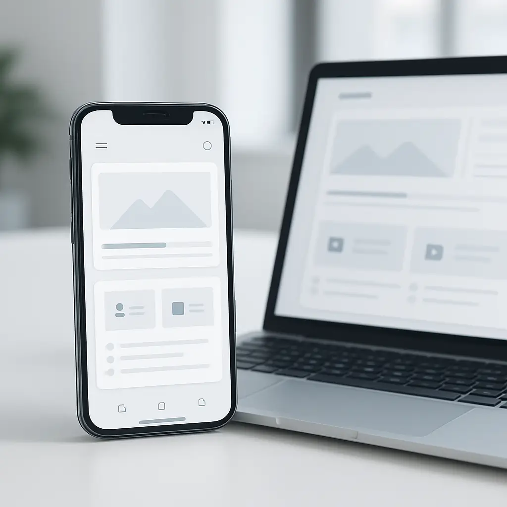
If your website is awkward on a phone, many visitors will leave before they ever read what you do.
That sounds harsh, but it is how people browse now. A potential customer may find you while sitting in a parked car, waiting at a clinic, comparing contractors at the kitchen table, or checking your menu from the sidewalk. If your site makes them pinch, zoom, squint, or hunt for the phone number, you are creating friction at the exact moment they are trying to choose you.
A mobile-friendly website is not just a smaller version of your desktop site. It is a website designed to work well on smaller screens, touch controls, slower connections, and distracted users.
For Canadian small businesses, that matters a lot. Whether you run a law firm, restaurant, clinic, real estate business, trades company, or local service business, your website often gets judged first on a phone.
What “Mobile-Friendly” Actually Means
A mobile-friendly website should feel natural on a phone. Visitors should not have to think about how to use it.
At a practical level, that means:
- Text is readable without zooming.
- Buttons and links are easy to tap with a thumb.
- The menu is simple and not overloaded.
- Pages load quickly on mobile data.
- Images resize properly instead of spilling off the screen.
- Contact forms are short and easy to complete.
- Phone numbers, directions, booking links, and quote requests are easy to find.
- The layout adapts to different screen sizes, not just one phone model.
The goal is not to impress people with clever design. The goal is to help them do the thing they came to do.
That might be calling your office, booking an appointment, requesting a quote, checking service areas, reading reviews, placing an order, or finding your address.
Why Mobile-Friendliness Affects Sales and Leads
Most visitors are impatient on mobile. They are not sitting at a desk carefully exploring every page of your website.
They are usually trying to answer one of these questions quickly:
- Do you offer what I need?
- Are you near me?
- Can I trust you?
- How much does this roughly cost?
- How do I contact you?
If your mobile site hides those answers, visitors may not complain. They just leave and choose someone else.
This is especially true for service businesses. If a homeowner has a leaking pipe, a broken furnace, or an urgent legal question, they are not going to wrestle with a clumsy menu. They will tap back and call the next business in the search results.
For restaurants, mobile usability can directly affect reservations and online orders. If the menu is a PDF that is hard to read on a phone, or the order button is buried, customers may move on.
For clinics and professional practices, confusing mobile pages can reduce bookings. Patients and clients often want reassurance first, then a clear next step.
Mobile Design and Google Search
Google cares about the mobile version of your website because that is what many users see first.
If your mobile site is slow, cluttered, or hard to use, it can affect how people interact with your pages. Poor engagement, slow performance, and weak usability can all make your SEO work harder than it needs to be.
Mobile-friendliness is closely connected to page speed and Core Web Vitals. If you want a deeper explanation of how performance metrics affect WordPress sites, read Core Web Vitals for WordPress: What to Know.
Search rankings are never based on one single factor. Content quality, relevance, authority, competition, and local signals all matter. But if your site is painful to use on mobile, you are giving competitors an easy advantage.
Responsive Design Is the Starting Point
The most common approach to mobile-friendly design is responsive design. That means your website layout automatically adjusts depending on the screen size.
On a desktop, you may have multiple columns, a full navigation bar, large hero images, and wider content sections. On a phone, those same elements should stack neatly, simplify, and fit the screen.
A responsive website should not feel like the desktop site was squeezed until it barely fit. It should feel intentionally designed for mobile.
What to Check on Your Own Site
Open your website on your phone and look at it like a customer would. Do not just check the homepage. Test the pages that actually generate business.
For most small businesses, that includes:
- Homepage
- Contact page
- Service pages
- Booking or quote request forms
- About page
- Pricing or package pages, if you have them
- Location pages
- Menus, galleries, listings, or product pages
Try to complete a real task. Can you call the business in one tap? Can you submit the form without frustration? Can you find the address quickly? Can you understand what the company does within a few seconds?
If not, the issue is not just design. It is lost opportunity.
Speed Matters Even More on Mobile
A beautiful mobile layout will still fail if it loads slowly.
Mobile visitors may be on weaker connections, shared Wi-Fi, or cellular data. Large images, bloated plugins, heavy scripts, sliders, tracking tools, and poorly configured hosting can make your site feel sluggish.
On mobile, speed issues are more noticeable because the screen is smaller and the visitor is often less patient.
Common mobile speed problems include:
- Huge images uploaded straight from a camera or phone.
- Too many WordPress plugins loading scripts on every page.
- Unoptimized fonts and third-party embeds.
- Cheap hosting with slow server response times.
- No proper caching.
- Videos loading before the visitor asks to play them.
- Large background images that add little value on mobile.
If speed is a known issue on your WordPress site, this related guide is worth reading: Mobile Speed Optimization for WordPress Sites.
Ambrite’s cloud web hosting uses LiteSpeed, NVMe SSD storage, and Imunify360 security. That kind of hosting foundation can help, especially compared with overcrowded legacy shared hosting, but hosting alone will not fix a poorly built page. Design, images, plugins, caching, and maintenance all work together.
Our Canadian cloud hosting starts at $7.99/month CAD, and it is a good fit for many small business WordPress sites that need better performance without jumping into complex server management.
Your Mobile Homepage Should Be Ruthless
Desktop homepages often try to do too much. On mobile, that problem gets worse.
Your mobile homepage should quickly answer:
- Who are you?
- What do you offer?
- Where do you serve?
- Why should someone trust you?
- What should they do next?
Do not make visitors scroll through vague slogans before they reach useful information. A simple sentence like “Residential plumbing repairs in London, Ontario” is often more helpful than a clever headline that says nothing specific.
Your first call-to-action should match how customers actually contact you. For some businesses, that means “Call Now.” For others, it means “Book an Appointment,” “Request a Quote,” “View Menu,” or “Schedule a Consultation.”
Tip: On mobile, your main call-to-action should be visible near the top of the page. If a visitor has to scroll for a full minute to find out how to contact you, the page is working against you.
Navigation Should Be Simple, Not Clever
Mobile menus are easy to overload. If your desktop navigation has 12 top-level items, it will probably feel messy on a phone.
A good mobile menu usually focuses on the essentials:
- Services
- About
- Locations or service areas
- Reviews or results
- Contact
- Booking, quote request, or ordering
Avoid hiding important pages under vague labels. “Solutions” might sound polished, but “Services” is clearer. “Get Started” may work for some businesses, but “Book Appointment” or “Request Quote” is often better.
Clarity wins on mobile.
Forms Need Special Attention
Forms are where many mobile websites lose leads.
A desktop form with 12 fields may look reasonable on a large monitor. On a phone, it can feel like homework.
For mobile users, ask only for what you actually need to respond. In many cases, that means:
- Name
- Email or phone number
- Brief message
- Preferred date or service type, if relevant
You can collect more details later. The first goal is to start the conversation.
Make sure form fields are large enough to tap, labels are clear, error messages are easy to understand, and the submit button is obvious. Test the form yourself on a real phone, not only inside a website builder preview.
If your form collects personal information from Canadians, privacy matters too. Businesses should understand how they collect, use, store, and protect personal information. For more on that, see How to Comply with PIPEDA: Essential Privacy Policy Requirements for Canadian Websites.
Clickable Phone Numbers and Maps Are Basic Requirements
If phone calls matter to your business, your number should be tap-to-call on mobile.
Do not make visitors copy and paste your phone number. Do not bury it only in the footer. Do not place it inside an image where it cannot be tapped.
For location-based businesses, make your address easy to find and open in a maps app. This is especially useful for restaurants, clinics, offices, retail stores, and showrooms.
If you serve customers at their location, make your service area clear. A trades business in the Greater Toronto Area, for example, should not make visitors guess whether they serve Mississauga, Brampton, Markham, or Oshawa.
Images Must Be Designed for Small Screens
Images are often the biggest reason mobile pages become slow or awkward.
Good mobile image handling means:
- Images are compressed before or during upload.
- The site serves appropriately sized images for mobile screens.
- Important details are not cropped out on phones.
- Decorative images do not push important content too far down.
- Galleries are easy to swipe or tap.
Be careful with large hero images that look great on desktop but add little value on mobile. If the image forces your headline and contact button below the fold, it may be hurting conversions.
For real estate, restaurants, renovations, clinics, and portfolios, visuals matter. The tradeoff is that image-heavy pages need extra optimization. Otherwise, your best work becomes the reason the site feels slow.
Mobile Accessibility Is Part of Good Design
Mobile-friendly design and accessibility overlap. If a site is hard to read, hard to tap, or hard to navigate, it affects everyone, including people with disabilities.
Useful accessibility improvements include:
- Strong colour contrast between text and background.
- Readable font sizes.
- Clear headings.
- Buttons with descriptive text.
- Enough spacing between tap targets.
- Forms with proper labels.
- Content that works when zoomed.
Canadian businesses should take accessibility seriously, especially organizations serving the public. Requirements can vary by province and business type, so it is worth getting proper advice if your industry has specific obligations.
Even when compliance is not the immediate concern, accessible mobile design is simply better for customers.
When a Mobile App Is Not the Answer
Some business owners think they need an app when what they really need is a better mobile website.
For most small businesses, a mobile app is overkill. People usually do not want to download an app just to check your hours, book a consultation, view services, or order once in a while.
A responsive, fast, well-structured website is usually the better investment.
An app may make sense if customers log in frequently, use account-specific features, receive ongoing service updates, or interact with your business daily. But for most local service businesses, clinics, law firms, restaurants, and real estate professionals, your website should come first.
When Not to Redesign Everything
Not every mobile problem requires a full website redesign.
Sometimes you can get meaningful improvement by fixing a few specific issues:
- Compressing and resizing images.
- Simplifying the menu.
- Improving the contact form.
- Adding tap-to-call buttons.
- Removing unnecessary plugins or scripts.
- Improving caching and hosting performance.
- Reworking the homepage content order.
A full redesign makes sense when the structure is outdated, the theme is no longer maintained, the site is difficult to edit, or the mobile layout is broken across many pages.
But if the brand, content, and overall structure are still solid, targeted improvements may be enough. This is where an honest review helps. A good provider should not push a rebuild if maintenance and optimization will solve the real problem.
WordPress Sites Need Ongoing Mobile Testing
Mobile-friendly is not a one-time checkbox.
WordPress sites change over time. Plugins get updated. Themes change. New content gets added. Staff upload large images. A booking plugin changes its layout. A form field gets added. Suddenly, something that worked fine on mobile becomes clunky or broken.
That is why mobile testing should be part of regular website maintenance.
At a minimum, check these after major updates:
- Homepage layout
- Main service pages
- Contact forms
- Booking or ordering flows
- Menus and navigation
- Header and footer buttons
- Image galleries
- Checkout pages, if you sell online
Ambrite’s WordPress maintenance plans start at $49/month CAD and are designed for small businesses that do not want to worry about updates, security, backups, and routine site care. If your site generates leads or bookings, ongoing maintenance is usually cheaper than discovering a broken mobile form weeks later.
You can learn more about our maintenance services here: WordPress maintenance and security plans.
Canadian Considerations for Mobile Websites
Canadian businesses have a few mobile considerations that are easy to overlook.
Local Search Behaviour
Many mobile searches have local intent. People search for services “near me,” compare reviews, and tap directly from Google results.
Your website should clearly show your city, province, service areas, and contact details. If you serve multiple communities, make that obvious without stuffing the page with awkward keywords.
Bilingual Audiences
If you serve bilingual communities, especially in parts of Canada where English and French visitors are common, think carefully about the mobile language experience.
A language switcher should be easy to find and tap. Translated pages should be complete and useful, not partial afterthoughts. If you are not ready to maintain both languages properly, it may be better to start with your primary audience and plan a proper bilingual rollout later.
Privacy and Trust
Mobile visitors may submit personal details through contact forms, booking forms, intake forms, or checkout pages.
Your site should use HTTPS, avoid asking for unnecessary sensitive information, and clearly explain how personal information is handled. This is especially important for legal, healthcare, financial, and professional service websites.
A Practical Mobile-Friendly Checklist
Use this checklist to review your site on a real phone:
- Can you understand what the business does within five seconds?
- Is the main call-to-action visible without much scrolling?
- Can visitors call you with one tap?
- Is the menu short and easy to use?
- Are service areas or locations clear?
- Is the text readable without zooming?
- Are buttons large enough to tap comfortably?
- Do forms work properly on mobile?
- Are images loading quickly and cropping correctly?
- Does the site feel fast on mobile data, not just office Wi-Fi?
- Are booking, ordering, quote, or checkout steps easy to complete?
- Does the site work well on more than one phone size?
If you answer “no” to several of these, your site is probably costing you leads.
What Ambrite Can Help With
Ambrite helps Canadian small businesses with web design, WordPress maintenance, and cloud hosting. Mobile-friendliness touches all three.
A good mobile website needs clean design, fast hosting, careful WordPress setup, optimized images, working forms, and regular maintenance. If one of those pieces is weak, visitors feel it.
If you are planning a new site, we can help design it with mobile users in mind from the start. If your current WordPress site is slow or awkward on phones, we can review whether it needs targeted improvements, better hosting, maintenance, or a full redesign.
You can reach us here if you would like a practical review of your website: contact Ambrite.
Your mobile site does not need to be fancy. It needs to be clear, fast, trustworthy, and easy to use. That is what turns phone visitors into real customers.
This article was written with the help of AI and reviewed by the Ambrite team. Pricing, features, and technical details may change — always verify with official sources before making decisions.
Was this article useful?
Related Articles
Your website looks perfect on your laptop. Then you check it on your phone and everything's a...
Remember when parallax scrolling was the coolest thing on the web? Yeah, that was about eight...
Your website might be costing you customers right now. Not because it's broken or slow (though...
Your website loads in 0.8 seconds instead of 3 seconds, and suddenly your bounce rate drops by...
That beautiful website you spent months perfecting? It's driving customers away. Not because of...
