
Blog
Mobile Optimization for Restaurant Websites
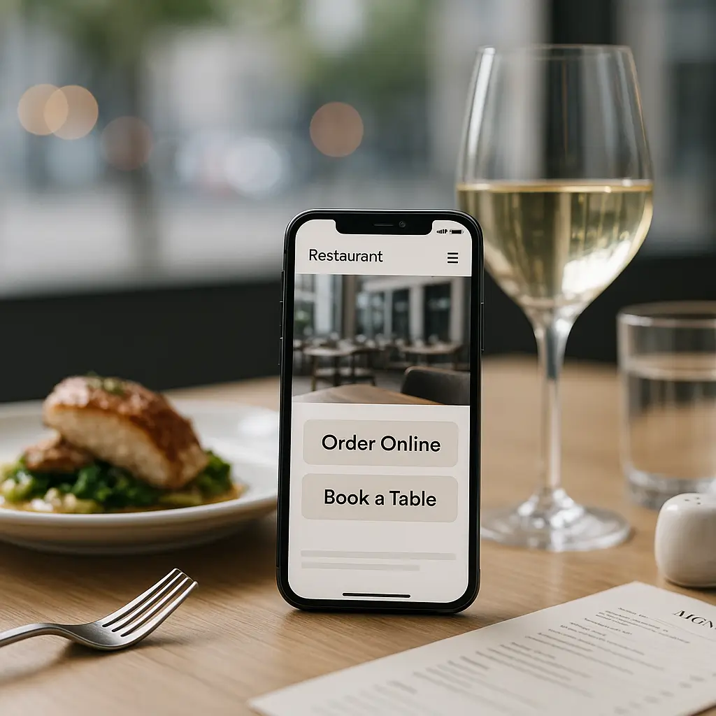
Your restaurant website has about three seconds to answer a hungry customer’s question: “Can I eat there, order from there, or book a table right now?”
Most restaurant website visits happen on phones. People are walking downtown, sitting in a car, comparing dinner options on the couch, or searching “pizza near me” while already hungry. If your site is slow, cramped, confusing, or hard to tap, they usually do not complain. They just choose somewhere else.
Mobile optimization for a restaurant website is not just about making the design “fit” on a smaller screen. It is about helping customers quickly find your menu, hours, location, phone number, ordering link, reservation option, and reviews without friction.
This guide explains what to check, what to fix first, and when a restaurant owner should avoid overcomplicating things.
What Mobile Optimization Means for Restaurant Websites
For restaurants, mobile optimization means your website works well for people who are hungry, distracted, and often in a hurry.
A well-optimized mobile restaurant site should let visitors:
- View the menu without pinching, zooming, or downloading a huge PDF
- Tap to call the restaurant
- Get directions quickly
- See hours, holiday closures, and service changes
- Order online without broken buttons or confusing checkout steps
- Book a table, if reservations are offered
- Find delivery, pickup, patio, catering, or private dining information
- Read key details like allergens, dietary options, and pricing
That sounds basic, but many restaurant sites fail on one or more of these points.
A beautiful desktop homepage with full-screen food photography may look great on a laptop. On a phone, the same page can become slow, awkward, and frustrating if it is not built carefully.
Start With the Customer’s Real Mobile Journey
Before changing plugins or redesigning pages, think about what mobile visitors actually need.
Most restaurant visitors are not reading your full brand story first. They are looking for a fast answer.
Common mobile visitor goals
- “Are you open?” Put hours near the top, especially if they change by day.
- “What’s on the menu?” Make the menu easy to read on a phone.
- “Where are you?” Use a clear address and directions button.
- “Can I order now?” Make ordering buttons obvious and test them often.
- “Can I reserve?” Keep booking links easy to find and easy to tap.
- “Is this place right for my group?” Show dietary options, kids’ options, patio details, parking notes, and accessibility details where relevant.
Your mobile homepage should answer those questions quickly. If visitors have to open the menu, close a pop-up, scroll past five photo sections, and then hunt for the order button, the site is working against you.
Quick test: Hand your phone to someone who has never used your site. Ask them to find your menu, call the restaurant, and get directions. If they hesitate, your mobile experience needs work.
Make Your Menu Mobile-Friendly
The menu is usually the most visited page on a restaurant website. It is also one of the most commonly mishandled.
The biggest mistake is uploading a large PDF menu and calling it done.
Why PDF menus are often bad on mobile
PDF menus can be useful for printing, but they are usually not ideal as the main mobile menu experience.
Common PDF menu problems include:
- Text is too small on phones
- Customers have to pinch and zoom
- Large files load slowly on mobile data
- Menus are harder for search engines to understand
- Updates are easy to forget when prices or items change
- Screen readers may not handle poorly formatted PDFs well
A better approach is to build the menu as an actual web page using text, categories, prices, descriptions, and optional photos. You can still offer a downloadable PDF if customers ask for it, but it should not be the only option.
If you update your menu often, use a structure that is easy for staff or your maintenance provider to edit safely. For more detail, see How to Update Your Menu Without Breaking Your Site.
Mobile menu layout tips
- Use clear sections like Appetizers, Mains, Pizza, Drinks, Desserts, and Kids’ Menu
- Keep item names and prices aligned cleanly
- Avoid tiny decorative fonts
- Use short descriptions instead of long paragraphs
- Label vegetarian, vegan, gluten-friendly, spicy, and nut-containing items when appropriate
- Keep photos compressed and selective
- Do not hide the full menu behind complicated tabs that are hard to tap
If you have many menu categories, a sticky “jump to section” menu can help. Just make sure it does not cover half the phone screen.
Put Calls to Action Where Thumbs Can Reach Them
On desktop, visitors use a mouse. On phones, they use thumbs.
Buttons need to be large enough to tap comfortably, spaced far enough apart, and placed where people naturally look.
Useful mobile restaurant buttons
- Call Now
- Order Online
- Reserve a Table
- View Menu
- Get Directions
- Buy Gift Card
You do not need all of these in the same giant button row. Pick the actions that matter most to your restaurant.
A quick-service restaurant may prioritize “Order Online” and “Get Directions.” A fine dining restaurant may prioritize “Reserve a Table” and “View Menu.” A bakery may prioritize “Call Now” and “Catering.”
Do not make every button the same colour and size. If everything is urgent, nothing is urgent.
Speed Matters More Than Fancy Effects
Restaurant websites often use large food photos, Instagram feeds, sliders, embedded maps, online ordering scripts, reservation widgets, review widgets, pop-ups, and tracking scripts. Each one can slow the site down.
On mobile, that delay hurts. Someone standing outside in winter on a weak signal is not going to wait politely for your homepage animation to finish.
For a deeper speed guide, read Mobile Speed Optimization for WordPress Sites.
High-impact speed fixes for restaurant sites
- Compress food photos before uploading. Large original camera files are usually far too heavy for web use.
- Use modern image formats where supported. Many optimization tools can handle this automatically.
- Limit homepage sliders. They often look nice to owners but add weight and get ignored by visitors.
- Lazy load images below the fold. This helps the first visible part of the page load faster.
- Remove plugins you are not using. Old menu, gallery, coupon, or event plugins can add unnecessary code.
- Use caching carefully. Caching helps speed, but ordering carts, booking forms, and dynamic pages need testing.
- Choose fast hosting. Server response time affects how quickly WordPress starts loading.
Ambrite’s cloud web hosting uses LiteSpeed, NVMe SSD storage, and Imunify360, which can make a noticeable difference for WordPress restaurant sites compared with overloaded low-cost hosting. Hosting starts at $7.99/month CAD.
That said, hosting alone will not fix a bloated site. If your homepage loads twenty oversized photos and six third-party widgets, even good hosting has to work harder than it should.
Be Careful With Third-Party Ordering and Reservation Tools
Online ordering and reservation systems are essential for many restaurants. They are also common sources of mobile problems.
Some tools load external scripts. Some use embedded widgets. Some redirect customers to another platform. Some work beautifully on desktop but feel clunky on mobile.
What to test on mobile
- Can customers start an order from the homepage?
- Does the ordering page load quickly on cellular data?
- Are menu items readable without zooming?
- Can modifiers and add-ons be selected easily?
- Does the cart work properly?
- Are pickup and delivery options clear?
- Does payment work on common mobile browsers?
- Do confirmation emails or texts arrive as expected?
- Can customers book a table without creating unnecessary friction?
Test from a real phone, not just a desktop browser resized to look narrow. Real devices reveal issues that previews miss.
If online ordering is a major revenue channel, treat it like equipment in your kitchen. It needs regular checks. Our guide on How to Keep Your Online Ordering System Running covers this in more depth.
Do Not Let Pop-Ups Block Hungry Customers
Pop-ups can be useful for holiday hours, special events, email signups, or limited-time offers. They can also make mobile visitors leave immediately.
On a phone, a pop-up that is easy to close on desktop may cover the entire screen. The close button may be tiny, hidden, or too close to another tap target.
Use mobile pop-ups only when they are worth it
A good mobile pop-up might say:
- “Closed Monday for the holiday”
- “Patio now open”
- “Valentine’s reservations now available”
- “Kitchen closes at 9 PM tonight”
A bad mobile pop-up interrupts someone trying to view your menu just to ask them to join a newsletter.
If you use pop-ups, test them on iPhone and Android screen sizes. Make sure they are easy to close and do not appear on every page view.
Keep Hours, Location, and Contact Details Obvious
Restaurant websites lose customers when basic information is hidden.
Your mobile site should show your address, hours, phone number, and directions link clearly. Do not bury them only in the footer if your homepage is long.
Mobile contact checklist
- Use a tap-to-call phone number
- Show the full street address
- Include city and province for clarity
- Link to directions through a button or map
- List parking details if parking is confusing
- Mention entrance details if the location is inside a market, mall, hotel, or shared building
- Keep holiday hours current
Canadian restaurants should also think about bilingual needs where relevant. If your restaurant serves customers in both English and French, especially in parts of Canada where bilingual communication is expected, the mobile experience should work well in both languages. Do not make one language version polished and the other outdated.
Design for Readability, Not Just Looks
Restaurant branding matters. But if the design makes the site hard to read on a phone, it is costing you customers.
Common mobile readability issues include:
- Light grey text on white backgrounds
- Text placed over busy food photography
- Script fonts used for menu descriptions
- Tiny prices
- Long paragraphs on the homepage
- Buttons with low contrast
- Navigation menus with too many items
Food photography should support the customer’s decision, not compete with the information they need.
If you use text over photos, add enough contrast. Better yet, keep critical information like hours, menus, and ordering buttons on clean backgrounds.
Simplify the Mobile Navigation
A restaurant website does not need a complicated mobile menu.
Most sites can use a simple structure like:
- Menu
- Order Online
- Reservations
- Hours & Location
- Events or Catering
- Contact
If your navigation has fifteen items, mobile users have to work too hard. Combine pages where it makes sense.
For example, “Hours,” “Location,” and “Contact” can often live together. “Private Events” and “Catering” might be separate if they are major revenue streams, but they should not be buried under vague labels like “Experiences.”
Watch Out for Plugin Bloat
WordPress makes it easy to add features. That is helpful, but it can get messy.
A restaurant site might have separate plugins for menus, pop-ups, reservations, ordering, galleries, reviews, maps, events, SEO, caching, security, forms, sliders, and social feeds. Some are useful. Some are leftovers from old campaigns.
Too many plugins can slow the site, create conflicts, and increase maintenance work. Outdated plugins can also create security risk.
Review your plugins regularly and ask:
- Do we still use this?
- Does it affect the mobile experience?
- Is it actively maintained?
- Is there a lighter way to do the same thing?
- Does it conflict with ordering, reservations, or caching?
Do not delete plugins blindly on a live site. Some plugins control shortcodes, layouts, forms, or menu data. Test changes first or have a maintenance provider handle it.
Test the Site Like a Customer, Not an Owner
Restaurant owners often check the website from the office, on Wi-Fi, while already knowing where everything is. Customers do not have that advantage.
Test the site in the situations your customers are actually in.
Useful mobile tests
- Use cellular data instead of Wi-Fi
- Test during lunch or dinner rush, when people are most likely to order
- Try both iPhone and Android if possible
- Check the site in private browsing mode so you are not seeing a cached admin-friendly version
- Ask someone unfamiliar with the site to find the menu and place a test order
- Check that forms and booking confirmations arrive
- Confirm that buttons are not blocked by cookie banners or pop-ups
Make this a monthly habit. Also test after plugin updates, theme updates, menu changes, and ordering system changes.
When Not to Add More Features
More features do not always mean a better restaurant website.
You may not need a live chat widget if customers mostly call. You may not need an Instagram feed if it slows the homepage. You may not need a complex loyalty integration if it adds friction to ordering.
Be especially cautious with features that load third-party scripts on every page. Each one can affect speed, privacy, and reliability.
A simple, fast mobile site with a clear menu, obvious ordering button, accurate hours, and working directions will usually outperform a flashy site that makes customers wait.
Mobile SEO for Restaurants
Mobile optimization also affects how people find your restaurant through search.
Google wants to send users to pages that load well and answer the search intent. If your menu page is slow, unreadable, or trapped inside a PDF, you may be making local SEO harder than it needs to be.
For restaurants, helpful SEO basics include:
- Use text-based menus where possible
- Include your city and neighbourhood naturally on key pages
- Keep your name, address, and phone number consistent
- Create pages for catering, private events, delivery, or special services if customers search for them
- Make sure your Google Business Profile links to the correct page
- Keep hours consistent between your website and business listings
Do not stuff keywords into your menu or homepage. Write naturally. “Wood-fired pizza in Halifax” is useful if that is what you offer. Repeating “best pizza Halifax restaurant pizza near me” everywhere looks bad and reads worse.
Privacy and Customer Data Considerations
If your mobile site collects personal information through reservations, contact forms, catering inquiries, newsletter signups, or online ordering, privacy matters.
Canadian businesses should understand their responsibilities under privacy laws such as PIPEDA where applicable. You do not need to turn your homepage into a legal document, but you should be clear about what information you collect, why you collect it, and how customers can contact you about it.
This is especially relevant if you use third-party ordering, booking, or email marketing tools. Check their current privacy documentation and make sure your own policies reflect how customer information is actually handled.
Maintenance Tasks That Keep Mobile Working
Mobile optimization is not a one-time project. Restaurant websites change often: menus, prices, hours, photos, promos, seasonal pages, reservation rules, and ordering settings.
Here are the maintenance tasks worth scheduling:
- Update WordPress core, themes, and plugins safely
- Test online ordering and reservation flows
- Check mobile page speed
- Compress new images before or during upload
- Review menus for outdated prices or unavailable items
- Check forms and confirmation emails
- Test tap-to-call and directions links
- Review pop-ups and seasonal notices
- Back up the site before major changes
- Remove unused plugins and pages carefully
Ambrite’s WordPress maintenance plans start at $49/month CAD and are built for small businesses that do not want to babysit updates, security, backups, and site health themselves.
For restaurants, that ongoing care can be the difference between “we did not notice the order button was broken” and “we caught the issue before dinner service.”
A Practical Mobile Optimization Checklist
If you want a quick place to start, use this checklist on your phone.
Homepage
- Is the main action obvious within a few seconds?
- Can customers reach the menu, ordering, reservations, phone, and directions quickly?
- Does the page load quickly on cellular data?
- Are photos optimized?
- Are pop-ups easy to close?
Menu
- Is the menu readable without zooming?
- Are prices current?
- Are categories easy to scan?
- Are dietary labels clear where needed?
- Is there a non-PDF option?
Ordering and reservations
- Can customers complete the process on a phone?
- Are buttons large enough to tap?
- Do confirmation messages work?
- Are payment and pickup/delivery options clear?
- Have you tested after recent updates?
Contact and location
- Is the phone number tap-to-call?
- Is the address easy to find?
- Do directions links work?
- Are hours accurate?
- Are holiday or seasonal changes visible?
When a Redesign Makes More Sense Than Small Fixes
Sometimes mobile problems can be fixed with better images, cleaner navigation, caching, and plugin cleanup.
Other times, the site’s theme or page builder is the problem. If every small change breaks the layout, or the mobile design depends on outdated plugins, a redesign may be more cost-effective than patching the same issues repeatedly.
Consider a redesign if:
- The mobile layout is consistently awkward across many pages
- The theme is no longer maintained
- The site relies on old shortcodes or abandoned plugins
- Ordering or reservations are hard to integrate cleanly
- Your brand, menu, or service model has changed significantly
- Performance is poor even after reasonable optimization
Do not redesign just because the site feels a bit old. Redesign when the current site is blocking customers, staff, or revenue.
If you are unsure whether you need maintenance, optimization, or a full rebuild, Ambrite can review the site and recommend the practical route. You can reach us through our contact page.
The Best Mobile Restaurant Sites Are Usually Simple
A strong mobile restaurant website does not need to be complicated.
It needs to be fast, clear, accurate, and easy to use while someone is hungry. Show the menu. Show the hours. Make ordering, calling, booking, and directions obvious. Keep plugins lean. Test the important paths regularly.
That is what turns mobile visitors into real customers.
This article was written with the help of AI and reviewed by Ambrite. Pricing, features, and technical details may change. Always verify with official sources before making decisions.
Was this article useful?
Related Articles
Your WordPress site loads in 8 seconds on mobile. Meanwhile, your competitor's site loads in 2...
Running a restaurant in 2026 means juggling a thousand things at once. Your WordPress site...
Your WordPress site has 47 active plugins and takes 8 seconds to load. Sound familiar? Plugin...
Your real estate website is more than just a digital business card: it's a 24/7 sales machine...
Your staff page hasn't been updated since Jessica left in 2022, and your services page still...
