
Blog
Mobile Optimization for Real Estate Websites
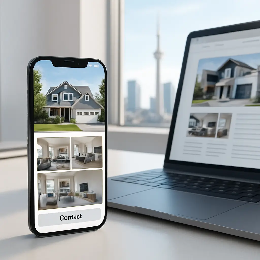
A buyer can fall in love with a listing on their phone, then abandon it ten seconds later because the photos load slowly or the contact button is hard to tap.
That is the reality for real estate websites. Your site is not just a brochure. It is often the first showing, the first credibility check, and the first chance to capture a lead.
For Canadian Realtors, brokerages, property managers, and real estate teams, mobile optimization is not only about “looking good on a phone.” It affects lead generation, search visibility, listing engagement, form submissions, and how much trust a visitor feels before they ever call you.
This guide walks through the practical mobile issues we see most often on WordPress real estate websites, and what to fix first.
Why mobile matters so much for real estate websites
Real estate browsing is naturally mobile-heavy. People search during lunch breaks, while commuting, after seeing a lawn sign, or while standing outside a property.
If your site is difficult to use on a phone, visitors usually do not complain. They just leave, go back to Google, and click another agent’s site.
Mobile optimization affects:
- How quickly listing pages load
- Whether users can swipe through property photos smoothly
- How easy it is to call, text, email, or book a showing
- How well your site performs in Google search
- How professional your brand feels to sellers researching you
- Whether lead forms actually get completed
Real estate websites also have some special mobile challenges. Large image galleries, embedded maps, IDX or MLS feeds, mortgage calculators, video tours, and third-party scripts can all slow things down.
That does not mean you should remove everything useful. It means every feature needs to earn its place on a mobile screen.
Start with the pages that make you money
Do not begin by optimizing every page equally. Start with the pages most likely to generate leads.
For most real estate websites, that means:
- Homepage
- Active listing pages
- Neighbourhood or community pages
- Buyer and seller service pages
- Contact page
- Home valuation landing page
- Showing request or lead capture forms
Open each of these pages on an actual phone, not just your desktop browser resized to a narrow window. A page can look fine in a desktop preview and still feel awkward on a real device.
Check it on Wi-Fi and on mobile data. Many real visitors are not browsing under perfect conditions.
Quick test: Hand your phone to someone who has never used your site and ask them to find a listing, view the photos, and contact you. Do not help them. Watch where they hesitate.
Fix mobile speed before redesigning everything
A beautiful real estate website that loads slowly is still a problem. Mobile visitors are impatient, especially when they are comparing several listings or agents at once.
The biggest speed problems on real estate websites usually come from:
- Oversized property photos uploaded directly from a camera or phone
- Too many homepage sliders or animation effects
- Map embeds loading immediately on every page
- IDX or MLS tools loading scripts site-wide
- Too many plugins doing overlapping jobs
- Poor caching or underpowered hosting
You do not need to chase a perfect speed score. You do need the site to feel fast enough that users can browse without friction.
If mobile speed is already a known issue, start with our related guide: Mobile Speed Optimization for WordPress Sites.
Practical speed fixes for real estate sites
Here are the fixes that usually make the biggest difference:
- Resize listing photos before upload. Do not upload massive originals if your theme only displays them at web size.
- Use modern image compression. WordPress image optimization plugins can help, but check the official plugin documentation for current setup recommendations.
- Limit sliders. A rotating homepage slider with several huge images often hurts more than it helps on mobile.
- Lazy-load below-the-fold media. Property images, maps, and videos should not all load at once if the user has not reached them yet.
- Review IDX scripts. Some listing tools load heavy JavaScript. Ask whether they need to load on every page or only listing-related pages.
- Use proper caching. LiteSpeed Cache is a strong option on LiteSpeed hosting, but settings should be tested carefully.
Be careful with aggressive optimization settings. Combining, delaying, or minifying scripts can break maps, forms, sliders, or IDX searches if done without testing.
This is where a staging site helps. Test changes before applying them to the live site, especially during busy selling seasons.
Make listing photos mobile-friendly
Photos sell the click. On mobile, they need to load quickly and be easy to browse with a thumb.
The goal is not to make every image tiny and blurry. The goal is to serve images that are sharp enough for mobile screens without wasting bandwidth.
Good mobile photo practices include:
- Use consistent image dimensions across listings
- Compress images before or during upload
- Avoid uploading duplicate versions of the same photo
- Use gallery layouts that support swiping
- Make sure captions or room labels are readable
- Do not hide key listing photos behind tiny carousel arrows
If you use professional photography, ask your photographer for web-optimized versions as well as high-resolution originals. The originals are useful for print and marketing materials, but they are usually too large for direct website upload.
For luxury listings, acreage properties, or commercial real estate, you may need more images than usual. That is fine, but the gallery should load progressively instead of forcing the entire page to load every file immediately.
Design for thumbs, not mouse clicks
Desktop sites are clicked. Mobile sites are tapped, swiped, pinched, and scrolled.
That changes how buttons, menus, forms, and galleries should work.
On a real estate site, mobile users should be able to quickly:
- Call you
- Email you
- Request a showing
- Save or share a listing
- View photos
- See the address or general area
- Check basic property details
Make tap targets large enough. If users need to zoom in to tap “Book a Showing,” the design is working against you.
Also watch the spacing between links. On mobile, links that are too close together cause mis-taps, especially in listing detail sections with many small fields.
Use sticky contact options carefully
A sticky “Call” or “Request Showing” button can work very well on mobile. It keeps the next step visible while someone browses a listing.
But do not overdo it. Sticky bars can cover listing photos, block map controls, or make the page feel cramped.
A good mobile sticky button should:
- Use clear language such as “Call Agent” or “Book a Showing”
- Stay out of the way of gallery controls
- Not cover important listing details
- Be easy to dismiss if it takes up too much space
If you serve both buyers and sellers, avoid making every mobile call-to-action buyer-focused. Sellers researching your track record need a clear path too.
Simplify your mobile navigation
Real estate websites often grow messy over time. New listing categories, community pages, blog posts, market reports, landing pages, and team profiles all get added.
On desktop, a large menu might be tolerable. On mobile, it becomes a maze.
Your mobile menu should prioritize the pages people actually need:
- Search Listings
- Featured Listings
- Buyers
- Sellers
- Neighbourhoods
- About
- Contact
If you have many neighbourhood pages, do not list every one in the main mobile menu. Use a parent “Neighbourhoods” page with a clean internal list instead.
Keep menu labels plain. “Find Your Dream Home” might sound nice, but “Search Listings” is faster to understand.
Make lead forms short and reliable
Mobile users do not want to fill out long forms. They especially do not want to type the same information twice because a form error wiped their answers.
For real estate, the best mobile forms are short, clear, and tested regularly.
A showing request form might only need:
- Name
- Phone number
- Preferred date or time
- Short message field
A home valuation form may need a property address, but avoid asking for too much too soon. If you make the form feel like homework, fewer people will complete it.
Make sure form fields use the right mobile keyboard. Phone fields should open a number-friendly keyboard. Email fields should be set up for email entry.
Also test deliverability. A form that looks good but sends leads to spam is quietly costing you money. For a deeper real estate-specific checklist, see Lead Capture Form Testing: A Realtor's Guide.
Do not rely only on forms
Some visitors prefer calling. Some prefer email. Some want to text. Some are browsing after hours and want to book a showing request without speaking to anyone yet.
Give people options, but do not clutter the page with every possible contact method in every section.
On mobile, the most effective pattern is usually:
- A visible phone link near the top
- A primary form on listing pages
- A simple contact section near the bottom
- Clickable email and phone details in the footer
If you add SMS or chat tools, test them carefully. Some chat widgets slow down mobile pages or cover important buttons.
Watch your IDX or MLS integration
IDX and MLS integrations are useful, but they can be one of the heaviest parts of a real estate WordPress site.
Depending on the provider and setup, listing search tools may load external scripts, map tools, filters, tracking code, and styling assets. That can affect speed and layout on mobile.
Before changing IDX settings, check the provider’s current documentation or ask their support team. These systems vary, and guessing can break search or compliance-related display requirements.
Questions worth asking your IDX provider include:
- Can scripts load only on listing/search pages instead of the whole site?
- Does the search interface support mobile filters properly?
- Are map results lazy-loaded?
- Can listing photos be optimized without violating feed requirements?
- Does the integration work well with caching?
If a specific IDX tool is slow, switching providers is not always the first answer. Sometimes the issue is the WordPress theme, caching setup, plugin conflicts, or too many other scripts on the same page.
Make property details easy to scan
Mobile users skim listing pages quickly. They want the basics immediately.
Put the most important property details near the top:
- Price
- Address or area
- Bedrooms
- Bathrooms
- Square footage, if applicable
- Property type
- Key features
- Primary contact button
Avoid burying the contact button after a long description. If someone is interested after viewing the first few photos and details, they should not have to hunt for the next step.
Long listing descriptions are fine, but format them with short paragraphs and bullet points. A dense block of text is hard to read on a phone.
Use maps without slowing everything down
Maps are useful for real estate, but they can be heavy. Embedded maps often load scripts, tiles, fonts, and tracking resources.
On mobile, ask whether the map needs to load immediately. In many cases, it can appear after the main property details and images, or load only when the user taps to view it.
Also consider privacy and practical listing rules. Some properties should not show exact locations publicly, depending on seller preferences, board rules, or property type.
A good mobile map setup should:
- Not block page scrolling
- Be easy to open larger if needed
- Not load before the main content
- Respect seller privacy where required
- Work properly with touch gestures
If users accidentally drag the map instead of scrolling the page, that is a mobile usability problem.
Think about Canadian privacy requirements
Real estate websites collect personal information. Names, emails, phone numbers, property addresses, showing preferences, and home valuation requests can all be personal data.
In Canada, that means your site should take privacy seriously. PIPEDA may apply depending on how your business collects, uses, and stores personal information.
Your mobile forms should make it clear what users are submitting and why. Your privacy policy should be easy to find, including from mobile pages.
For a more detailed privacy overview, read How to Comply with PIPEDA: Essential Privacy Policy Requirements for Canadian Websites.
Also be careful with third-party tools. Chat widgets, analytics platforms, CRM integrations, email marketing tools, and form plugins may process visitor data. Check their current documentation and privacy terms rather than assuming everything is handled automatically.
Do not ignore accessibility on mobile
Mobile optimization and accessibility overlap. If text is too small, buttons are hard to tap, contrast is weak, or forms are confusing, the site becomes harder for everyone.
Real estate sites often use image-heavy layouts with text over photos. That can look polished, but it frequently causes readability problems on phones.
Check for:
- Readable font sizes without zooming
- Strong contrast between text and backgrounds
- Clear focus states for forms and buttons
- Alt text for meaningful property images
- Form labels that remain visible
- Buttons that can be tapped without precision
Do not place important listing information only inside images. Search engines and assistive technologies may not understand it properly, and mobile users may struggle to read it.
Review your plugins before adding more
When a real estate site has a mobile issue, the tempting fix is often “install another plugin.” Sometimes that helps. Often, it adds more weight.
Common plugin categories on real estate sites include:
- IDX or MLS integrations
- Gallery and slider plugins
- Form builders
- SEO plugins
- Cache and performance plugins
- Security plugins
- Analytics and tracking tools
- CRM or email marketing integrations
Each plugin can add scripts, styles, database queries, or external requests. The issue is not simply the number of plugins; it is what they do and where they load.
Before adding a new plugin, ask:
- Does my theme or existing plugin already do this?
- Will this load assets on every page?
- Is the plugin actively maintained?
- Can I test it on staging first?
- What happens if I remove it later?
When not to add a plugin: if you only need one small design change, a developer may be able to handle it more cleanly than installing a large plugin suite.
Test mobile after every important update
WordPress updates, theme updates, plugin updates, IDX changes, and form changes can all affect mobile layouts.
A site can work perfectly in the morning and have a broken mobile menu after an update later that day.
After updates, test:
- Homepage layout
- Mobile menu
- Listing search
- Listing photo galleries
- Showing request forms
- Contact forms
- Map embeds
- Call and email links
- Footer contact details
If your site is important to your lead flow, do not update blindly and hope for the best. Use backups, staging, and a repeatable testing checklist.
Ambrite’s WordPress maintenance plans start from $49/month CAD and are built for small businesses that do not want to babysit updates, security checks, backups, and testing themselves.
When a redesign makes more sense than optimization
Sometimes mobile issues can be fixed with targeted improvements. Sometimes the site is fighting you because the theme or builder is outdated, bloated, or poorly structured.
Optimization may be enough if:
- The design is still modern and usable
- The mobile layout mostly works
- The main issue is speed, image size, or plugin load
- The theme is still maintained
- Your forms and listing tools are reliable
A redesign may make more sense if:
- The mobile layout feels cramped everywhere
- The theme has not been maintained
- Every small change breaks something else
- Your branding no longer matches your business
- Your site cannot support your current IDX, CRM, or lead strategy
- You are embarrassed to send sellers to it
Do not spend months patching a site that should be rebuilt. But also do not redesign just because one gallery or form needs cleanup.
If you are unsure which path makes sense, Ambrite also offers website reviews and WordPress support for Canadian small businesses.
Hosting matters more than many agents realize
Real estate websites can be resource-heavy. Large galleries, dynamic listing searches, maps, and form tools need a hosting environment that can keep up.
Cheap hosting may work for a small brochure site, but it can struggle with listing-heavy WordPress websites. Slow server response times make every other mobile optimization harder.
Look for hosting with strong performance basics:
- Fast storage, such as NVMe SSD
- LiteSpeed or another performance-focused web server
- Server-level caching support
- Security scanning and malware protection
- Reliable backups
- Canadian-friendly support and billing
Ambrite’s cloud web hosting starts at $7.99/month CAD and includes performance-focused infrastructure such as LiteSpeed, NVMe SSD storage, and Imunify360 protection.
Hosting will not fix a badly built site by itself. But good hosting gives your optimization work a much better foundation.
A practical mobile optimization checklist for real estate sites
If you want a simple starting point, use this checklist:
- Open your homepage on a real phone and time how long it feels before you can use it
- Test your top three listing pages on mobile data
- Compress and resize oversized listing photos
- Remove unnecessary homepage sliders or heavy animations
- Make phone numbers tap-to-call
- Make primary contact buttons visible without hunting
- Shorten mobile forms where possible
- Send a test lead and confirm it arrives in the right inbox
- Check that mobile menus are simple and readable
- Review whether IDX scripts are loading on pages that do not need them
- Delay maps or videos until users need them
- Check privacy policy links near forms
- Test after plugin, theme, and WordPress updates
- Review analytics to find mobile pages with high exits
You do not need to fix everything in one afternoon. Start with the pages closest to revenue: listings, showing requests, home valuation forms, and your contact page.
What to avoid
Some mobile “improvements” sound good but cause problems.
- Do not hide important content on mobile just to make the page shorter. If buyers need it, make it easier to scan instead.
- Do not install multiple optimization plugins that all try to cache, minify, and delay scripts at the same time.
- Do not autoplay video tours on mobile. Let users choose when to load them.
- Do not make every button a pop-up. Pop-ups can be frustrating on small screens and may reduce trust.
- Do not rely only on automated tests. Speed tools are useful, but real-device testing catches issues scores miss.
- Do not optimize live during peak campaign traffic unless you have backups and a rollback plan.
The best mobile real estate sites feel simple, fast, and useful. They let visitors browse photos, understand the property, and contact you without friction.
If your site helps people do those three things on a phone, you are already ahead of many competitors.
This article was written with the help of AI and reviewed by the Ambrite team. Pricing, features, and technical details may change — always verify with official sources before making decisions.
Was this article useful?
Related Articles
Your WordPress site loads in 8 seconds on mobile. Meanwhile, your competitor's site loads in 2...
Running a restaurant in 2026 means juggling a thousand things at once. Your WordPress site...
Your WordPress site has 47 active plugins and takes 8 seconds to load. Sound familiar? Plugin...
Your real estate website is more than just a digital business card—it's a 24/7 sales machine...
Your staff page hasn't been updated since Jessica left in 2022, and your services page still...
